
In the realm of Adobe Experience Manager (AEM) development, optimizing images within AEM components is crucial. One highly effective method for achieving this optimization is by using adaptive rendering.
What are Adaptive Images ?
Adaptive images are a web development technique that ensures images on a website are delivered in the most suitable size and format for each user’s device and screen resolution. This optimization enhances website performance and user experience by reducing unnecessary data transfer and ensuring images look sharp and load quickly on all devices.
Example:

Let’s analyze the example, with a primary emphasis on the srcset attribute for the current blog:
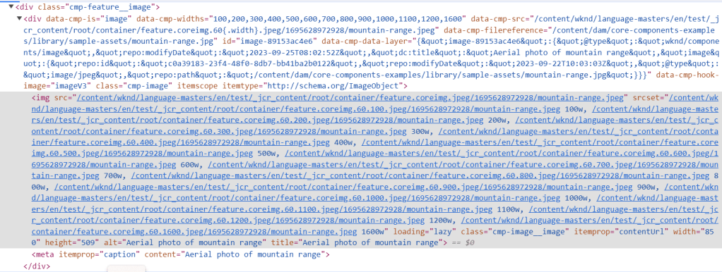
<div data-cmp-is="image" ...>: This is the HTML element that is generated by Image component . It has various attributes and data that provide information about the image.data-cmp-widths="100,200,300,400,500,600,700,800,900,1000,1100,1200,1600": These are different widths at which the image is available. These widths are used to serve the most appropriate image size to the user’s device based on its screen width.data-cmp-src="/content/wknd/language-masters/en/test/_jcr_content/root/container/feature.coreimg.60{.width}.jpeg/1695628972928/mountain-range.jpeg": This attribute defines the source URL of the image. Notice the{.width}placeholder, which will be dynamically replaced with the appropriate width value based on the user’s device.data-cmp-filereference="/content/dam/core-components-examples/library/sample-assets/mountain-range.jpg": This is a reference to the actual image file stored on the server.srcset="...": This attribute specifies a list of image sources with different widths and their corresponding URLs. Browsers use this information to select the best image size to download based on the user’s screen size and resolution.loading="lazy": This attribute indicates that the image should be loaded lazily, meaning it will only be loaded when it’s about to come into the user’s viewport, improving page load performance.
How Browsers Choose Images with srcset Based on Device Characteristics:
- Device Pixel Ratio (DPR): The browser first checks the device’s pixel ratio or DPI (Dots Per Inch), which measures how many physical pixels are used to represent each CSS pixel. Common values are 1x (low-density screens) and 2x (high-density screens, like Retina displays). DPR influences the effective resolution of the device.
- Viewport Size: The browser knows the dimensions of the user’s viewport, which is the visible area of the webpage within the browser window. Both the viewport width and height are considered.
- Image Size Descriptors: Each source in the
srcsetlist is associated with a width descriptor (e.g.,100w,200w) representing the image’s width in CSS pixels. These descriptors help the browser determine the size of each image source. - Network Conditions: Browsers may also consider the user’s network conditions, such as available bandwidth, to optimize image loading. Smaller images may be prioritized for faster loading on slower connections.
- Calculation of Effective Pixel Size: The browser calculates a “density-corrected effective pixel size” for each image source in the
srcset. This calculation involves multiplying the image’s declared width descriptor by the device’s pixel ratio (DPR). - Selecting the Most Appropriate Image: The browser compares the calculated effective pixel sizes to the viewport size. It chooses the image source that best matches the viewport width or height, ensuring that the image is appropriately sized for the user’s screen.
- Loading Only One Image: Typically, the browser loads only one image from the
srcsetlist. It selects the image source that is the closest match to the viewport dimensions. This approach optimizes performance and reduces unnecessary data transfer.
Example:
<img srcset="image-100w.jpg 100w, image-200w.jpg 200w, image-300w.jpg 300w" alt="Example Images">
Suppose the browser detects a
device with a DPR of 2x and a viewport width of 400 CSS pixels. In this case, the browser selects the image-200w.jpg source (200w) because it is the closest match to the viewport width of 400 pixels. Only the image-200w.jpg will be loaded, not all three images.
By dynamically selecting the most appropriate image source from the srcset, browsers optimize page performance and ensure that images look sharp on high-resolution screens while minimizing unnecessary data transfer on lower-resolution devices.
Implementing adaptive images for Components
In Adobe Experience Manager (AEM), both ResourceWrapper and data-sly-resource are used for including or rendering content from other resources within your AEM components. However, they serve slightly different purposes and are used in different contexts:
ResourceWrapper:
- Purpose:
ResourceWrapperis a Java class used on the server-side to manipulate and control the rendering of resources within your AEM components. - Usage:
- You use
ResourceWrapperwhen you want to programmatically control how a resource or component is rendered. - This appraoch is also used by WCM Core components like Teaser.
- You use
- Benefit: Utilized as an abstract class, ResourceWrapper provides advantages in terms of reusability, consistency, and streamlined development. In the context of components responsible for displaying images, developers can extend this abstract class and configure a property on the custom component. This approach expedites the development process, guarantees uniformity, simplifies customization, and, in the end, elevates efficiency and ease of maintenance.
data-sly-resource:
- Purpose:
data-sly-resourceis a client-side attribute used in HTL (HTML Template Language) to include and render other resources or components within your HTL templates. - Usage:
- You use
data-sly-resourcewhen you want to include and render other AEM components or resources within your HTL templates.
- You use
- Example:
<sly data-sly-resource="${resource.path @ resourceType='wknd/components/image'}"></sly>
Our focus will be on harnessing the power of the ResourceWrapper class from the Apache Sling API as a crucial tool for this purpose.
Understanding ResourceWrapper
The ResourceWrapper acts as a protective layer for any Resource, automatically forwarding all method calls to the enclosed resource by default.
To put it simply, in order to render an adaptive image in our custom component:
- We need to integrate a fileUpload field.
- Wrap this component’s resource using ResourceWrapper. The resource type associated with the image component will be added to the Wrapper.
- As a result, this newly enveloped resource can be effortlessly presented through the Image component.
It’s a straightforward process!
Now lets get into the details.
Step 1: Create an Image Resource Wrapper
The first step is to create an Image Resource Wrapper. This wrapper will be responsible for encapsulating the Image Resource and appending the Image ResourceType to the corresponding value map. This wrapped instance can then be used by Sightly to render the resource using the ResourceType. Please keep in mind that the URLs generated by Sightly depend on the policy of the Image component used.
Link to complete class: ImageResourceWrapper
public class ImageResourceWrapper extends ResourceWrapper {

    private ValueMap valueMap;
    private String resourceType;

    // Constructor to wrap a Resource and set a custom resource type
    public ImageResourceWrapper(@NotNull Resource resource, @NotNull String resourceType) {
        super(resource);

        if (StringUtils.isEmpty(resourceType)) {
            // Validate that a resource type is provided
            throw new IllegalArgumentException("The " + ImageResourceWrapper.class.getName() + " needs to override the resource type of " +
                    "the wrapped resource, but the resourceType argument was null or empty.");
        }
        this.resourceType = resourceType;

        // Create a ValueMapDecorator to manipulate the ValueMap of the wrapped resource
        valueMap = new ValueMapDecorator(new HashMap<>(resource.getValueMap()));
    }

....
}
Step 2: Create an Abstract Class for Reusability
To promote code reusability across components, create an abstract class that can be extended by various Models. Additionally, add utility functions that can be used by Models that extend this abstract class.
Link to Complete class: AbstractImageDelegatingModel
public abstract class AbstractImageDelegatingModel extends AbstractComponentImpl {

    /**
     * Component property name that indicates which Image Component will perform the image rendering for composed components.
     * When rendering images, the composed components that provide this property will be able to retrieve the content policy defined for the
     * Image Component's resource type.
     */
    public static final String IMAGE_DELEGATE = "imageDelegate";
    private static final Logger LOGGER = LoggerFactory.getLogger(AbstractImageDelegatingModel.class);

    // Resource to be wrapped by the ImageResourceWrapper
    private Resource toBeWrappedResource;

    // Resource that will handle image rendering
    private Resource imageResource;

    /**
     * Sets the resource to be wrapped by the ImageResourceWrapper.
     *
     * @param toBeWrappedResource The resource to be wrapped.
     */
    protected void setImageResource(@NotNull Resource toBeWrappedResource) {
        this.toBeWrappedResource = toBeWrappedResource;
    }

    /**
     * Retrieves the resource responsible for image rendering. If not set, it creates an ImageResourceWrapper based on the
     * configured imageDelegate property.
     *
     * @return The image resource.
     */
    @JsonIgnore
    public Resource getImageResource() {
        if (imageResource == null && component != null) {
            String delegateResourceType = component.getProperties().get(IMAGE_DELEGATE, String.class);
            if (StringUtils.isEmpty(delegateResourceType)) {
                LOGGER.error("In order for image rendering delegation to work correctly, you need to set up the imageDelegate property on" +
                        " the {} component; its value has to point to the resource type of an image component.", component.getPath());
            } else {
                imageResource = new ImageResourceWrapper(toBeWrappedResource, delegateResourceType);
            }
        }
        return imageResource;
    }

    /**
     * Checks if the component has an image.
     *
     * The component has an image if the '{@value DownloadResource#PN_REFERENCE}' property is set and the value
     * resolves to a resource, or if the '{@value DownloadResource#NN_FILE}' child resource exists.
     *
     * @return True if the component has an image, false if it does not.
     */

    protected boolean hasImage() {
        return Optional.ofNullable(this.resource.getValueMap().get(DownloadResource.PN_REFERENCE, String.class))
                .map(request.getResourceResolver()::getResource)
                .orElseGet(() -> request.getResource().getChild(DownloadResource.NN_FILE)) != null;
    }

    /**
     * Initializes the image resource if the component has an image.
     */
    protected void initImage() {
        if (this.hasImage()) {
            this.setImageResource(request.getResource());
        }
    }
}
Step 3: Create a Model for Sightly Rendering
Next, create a Model class that will be used by Sightly to render the image. This Model should extend the abstract class created in step 2.
Link to Complete class: FeatureImpl
Link to Complete interface: Feature
@Model(adaptables = SlingHttpServletRequest.class, adapters = Feature.class, defaultInjectionStrategy = DefaultInjectionStrategy.OPTIONAL)
public class FeatureImpl extends AbstractImageDelegatingModel implements Feature {

    // Injecting the 'jcr:title' property from the ValueMap
    @ValueMapValue(name = "jcr:title")
    private String title;

    /**
     * Post-construct method to initialize the image resource if the component has an image.
     */
    @PostConstruct
    private void init() {
        initImage();
    }

    public String getTitle() {
        return title;
    }
}
Step 4: Sightly Code for Rendering
In your Sightly code, use the Image resource type and the model created in step 3 to render the image. This is where you can customize how the image is displayed based on your project’s requirements.
<sly data-sly-template.image="${@ feature}">
    <div class="cmp-feature__image" data-sly-test="${feature.imageResource}" data-sly-resource="${feature.imageResource @wcmmode=disabled}"></div>
</sly>
These steps provide a structured approach to implement adaptive images for custom components using the WCM Core Image component in Adobe Experience Manager. Customize the Model and Sightly code as needed to suit your specific project requirements and image rendering policies.
Step 5: Configure Image Resource Type
In this step, you will configure the Image Resource Type to be used in the component’s dialog. This involves setting the imageDelegate property to a specific value, such as techrevel/components/image, within the component’s configuration. This definition is crucial as it specifies which Image Resource Type will be utilized for rendering.
Link to the component in ui.apps: Feature
<?xml version="1.0" encoding="UTF-8"?>
<jcr:root xmlns:jcr="http://www.jcp.org/jcr/1.0" xmlns:cq="http://www.day.com/jcr/cq/1.0" xmlns:sling="http://sling.apache.org/jcr/sling/1.0"
    jcr:primaryType="cq:Component"
    jcr:title="Feature"
    componentGroup="Techrevel AEM Site - Content"
    sling:resourceSuperType="core/wcm/components/image/v3/image"
    imageDelegate="techrevel/components/image"/>
Step 6: Add Image Upload Field to the Component’s Dialog
In the next step, you’ll enhance your component’s functionality by incorporating a file upload field into its dialog. This field allows you to easily upload images either from your local system or directly from AEM’s digital assets repository.
Link to the complete code of component’s dialog
Step 7: Verify Component Availability
Ensure component is available for use in your templates, allowing them to be added to pages. Additionally, it’s crucial to verify that you have appropriately configured the policy of the Image component. The policy of the Image component plays a pivotal role in generating the adaptive image’s URL, ensuring it aligns with your project’s requirements for image optimization and delivery.
At this point, with the knowledge and steps outlined in this guide, you should be fully equipped to configure images within your custom component.

When you inspect the URL of the image, it should now appear in a format optimized for adaptive rendering, ensuring that it seamlessly adapts to various device contexts and screen sizes.
This level of image optimization not only enhances performance but also significantly contributes to an improved user experience.
 Adobe Experience Cloud Blog
very nice article. Can you suggest if we want to have 2 or more images in the component , then how we can map the resource to image resource.
LikeLike
Question – I have used the same backend logic but the ‘imageResource’ comes as NULL but then in sightly if I try to check the “imageResource” it gives below resource.
ImageResourceWrapper, type=demo/components/image, path=/content/demo/us/en/feature-image/jcr:content/root/container/feature, resource=[TemplatedResourceImpl, type=demo/components/feature, path=/content/demo/us/en/feature-image/jcr:content/root/container/feature]
So, now when I removed the sling:resourceSuperType property from the component altogether as we have added our own fields so we do not need it, but after that my image stopped rendering.
Any idea, why we used it & what’s the issue over here?
LikeLike